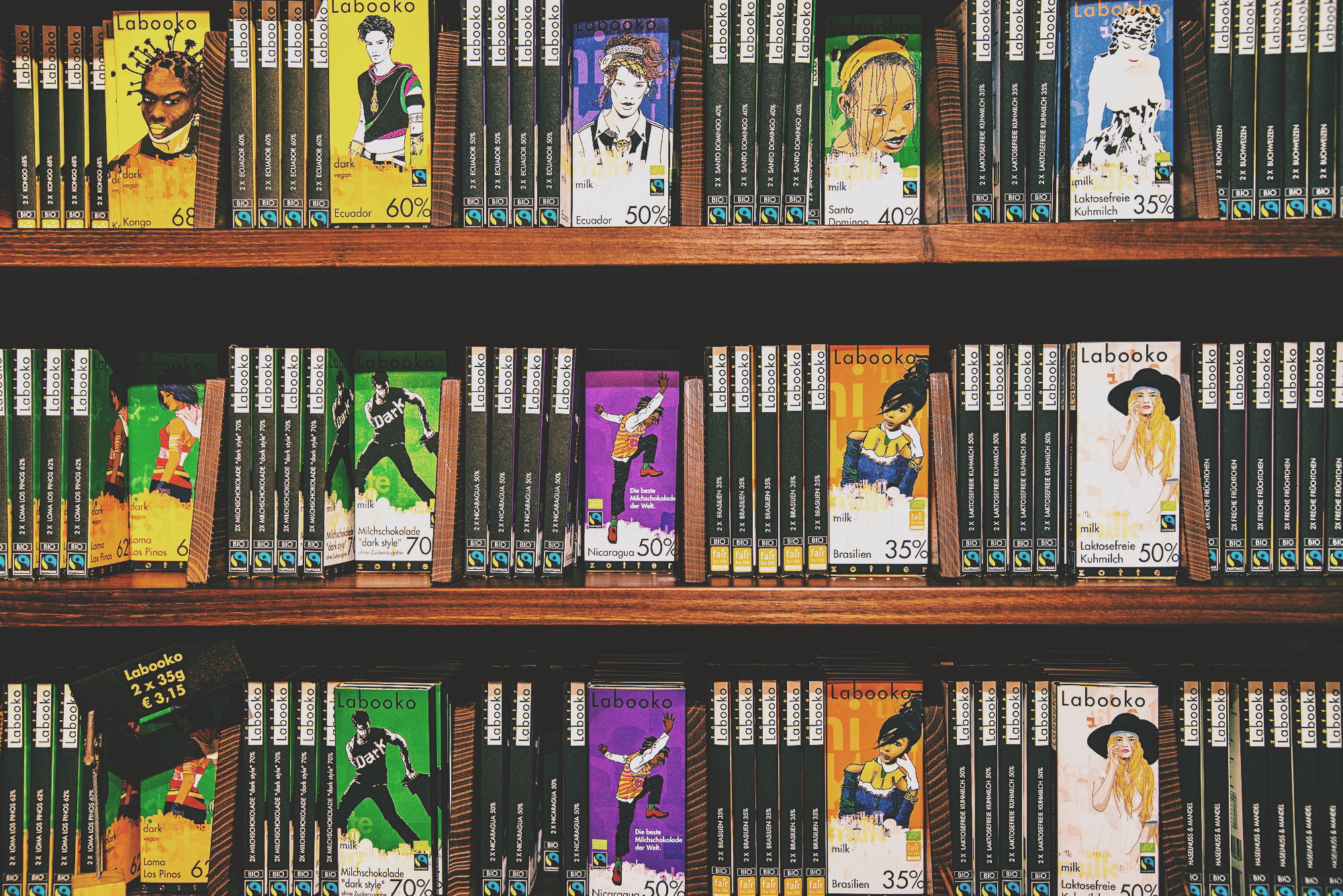
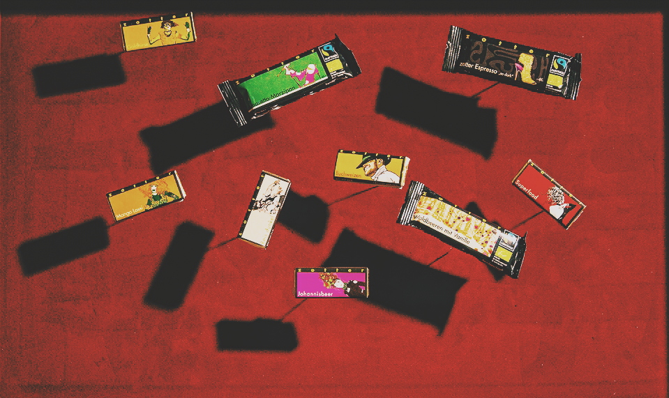
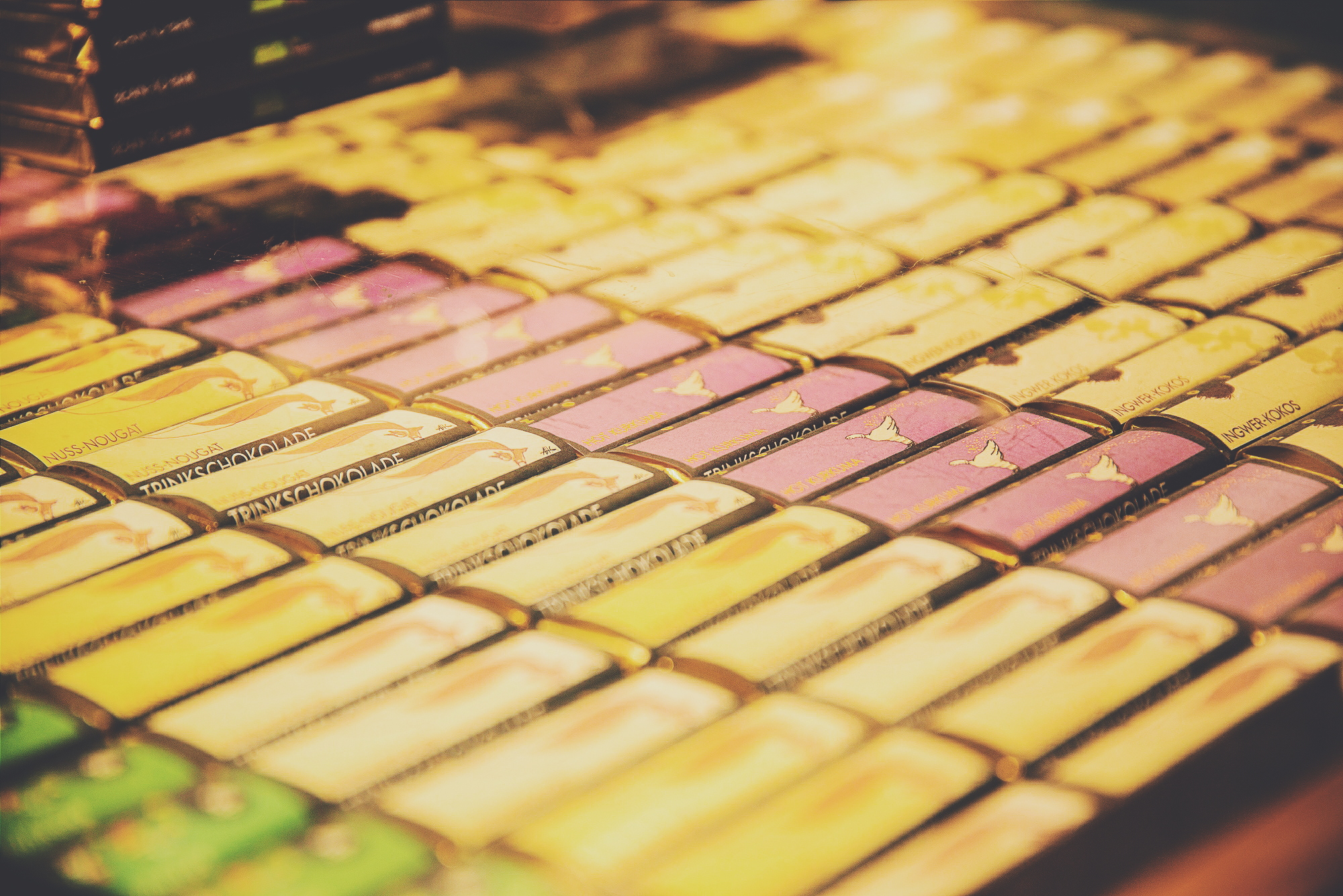
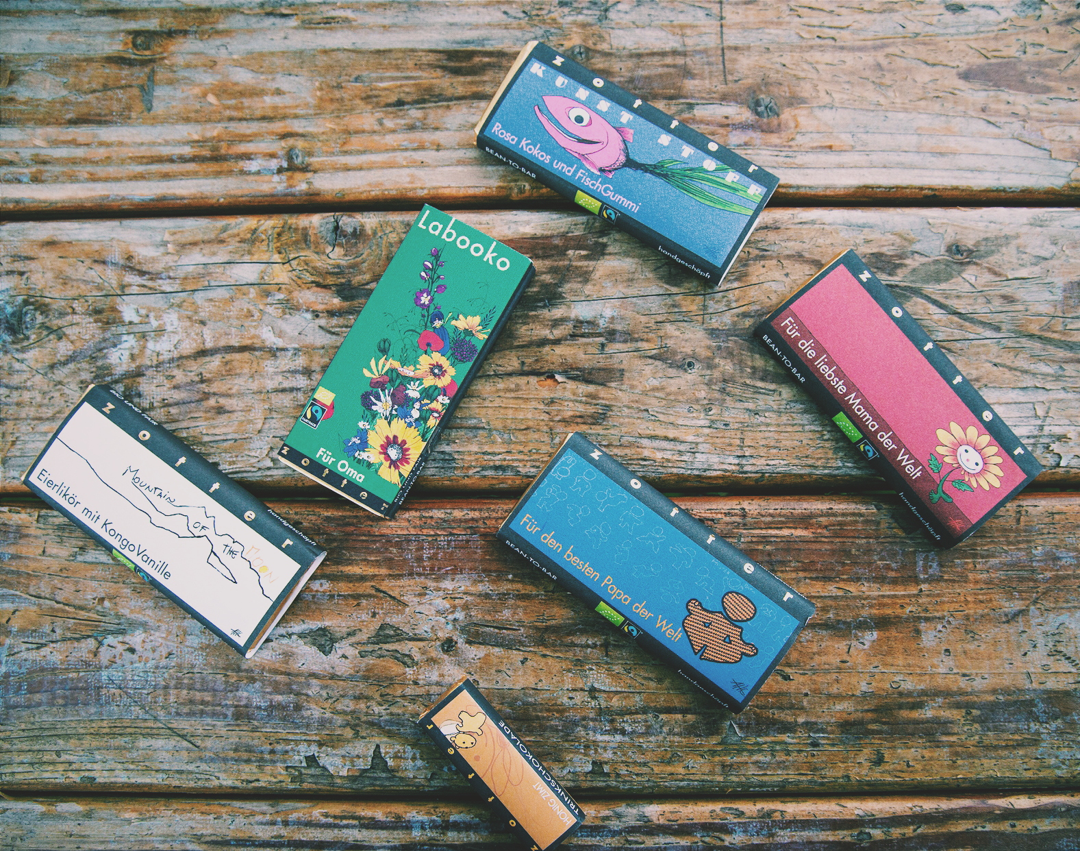
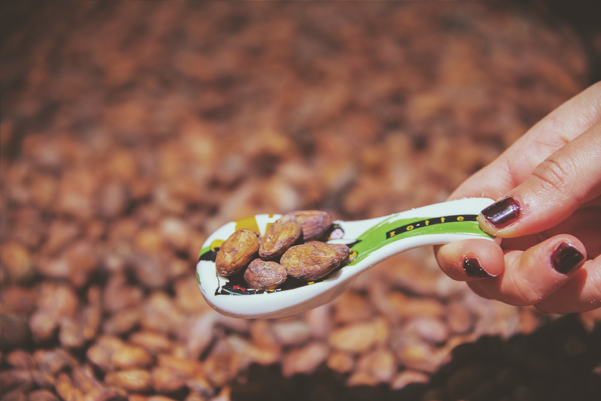
The amount of packaging design we are exposed to on a daily basis is tremendously high, and yet, only few catch our eye. What is then ‘good’ packaging? Simply, those we would not feel comfortable chucking them in the bin. The Austrian chocolatier Zotter manages to turn us into collectors with their artful packages. As their chocolate bars have edgy combinations like fish and raspberry, their wrappings too reflect a mixture of childish imagination and elegant minimalism. We asked Andreas H. Gratze about his hand-rendered and ecologic designs.


How did your collaboration start with Zotter?
I met Josef Zotter in 1981, when we both worked in the food and service industry. I trained to be a chef/waiter because my parents thought that was more tangible than pursuing breadless art. I have then also studied at the Art University in Graz and, after my studies, visited Josef at his confectionery shop. He had this idea back then to produce his own chocolate and I talked him into letting me design a beautiful packaging for it. The design was full of humour and the chocolate sold out quickly.
How much artistic freedom do you have?
Of course, if I’m working with a specific theme, such as pumpkin seed chocolate, I stick to the concept but I do still take all the liberties I can. Andy Warhol elevated packaging to art and I’m doing the opposite and bring art to packaging.
Do you first taste the chocolate?
I let the variety and the flavour guide me, get to taste it sometimes but not always, because the samples are often not even ready yet. I let the ingredients inspire me and sometimes I turn them into figures and characters.
What is your technique?
25 years ago, I drew and printed everything by hand of course. Now I often draw on paper in the garden and then flesh out the drawing digitally. I do the entire colour design on the computer because I can better define the colours that way. But, it doesn’t make a big difference to me, the computer is a tool and I’m still holding a pen in my hand, it just happens to be digital.
Was packaging design a career you consciously pursued?
I studied stage design, worked at a theatre, then turned to free art and put on exhibitions. The cooperation with Zotter happened on the side, born from our friendship. I really enjoy doing it because the company is really cool – with organic and fair-trade, simply a very sustainable overall concept.
What are you trying to evoke in the mind of the customer once they see your design?
I see the design as a projection surface. I don’t ask myself what the customer wants to see, but how I can surprise him or her. That means creating new perspectives and new associations, and putting simple things like pumpkin seeds into a new context to enliven them! Most adverts are simply too simple for me, too flat. We customers and consumers are no idiots, after all. Adverts may well challenge us, inspire us or make us smile. That’s important to me!
How do you define the Zotter designs?
I like to change styles, but I make sure that it stays consistent. The Labooko designs are more inspired by people, rich in detail and realistic. With hand-scooped chocolates, I do various things, sometimes art nouveau, sometimes graffiti, sometimes comic style, it all then comes into line with the black frame and the logo lettering, which is instantly recognisable.
Is your artwork ecologic as the chocolate?
Yes! I have always insisted that we bank on organic and fair trade. There are strict regulations in the food industry when it comes to packaging, so this can be limiting. But we go without the glossy coating of the paper, for example, so it can be recycled more easily, we print with eco-friendly colours on environmentally certified paper, we use organic plastic from renewable raw materials for the Mitzi series and filled chocolates, and I always try to make sure that we save on packaging and don’t get too opulent. We even make sure that the printer we use operates sustainably or prints cradle-to-cradle.
Which one is your favourite Zotter design?
I like them all. I enjoy designing Mitzi Blues because, as the youthful product line, they can naturally be a bit cheekier and crazier. At the moment, I am developing the Nashidos, little filled chocolate bars with a manga-inspired design that is mostly kept in black and white. That’s what I’m currently working on, so right now I think that is the best.
How much drawing do you have to do within a day?
I draw for about 10 hours a day. Most new products are created at the start of the season in summer, so that’s when I design 4 products a day, for sure, including drafts.
But aside from the products, there are also lots of other things to do, such as catalogues, trade fairs, shop design and everything that’s visible all around and runs across various channels. The most exhausting thing for me is when my wife says: “Come on, let’s go on holiday!”