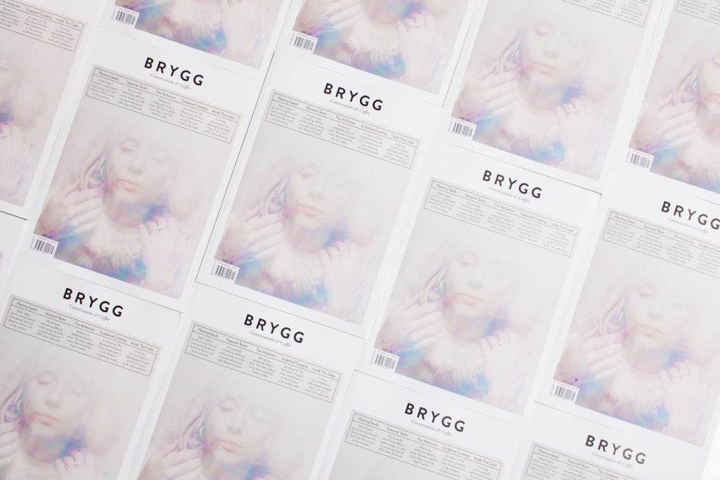
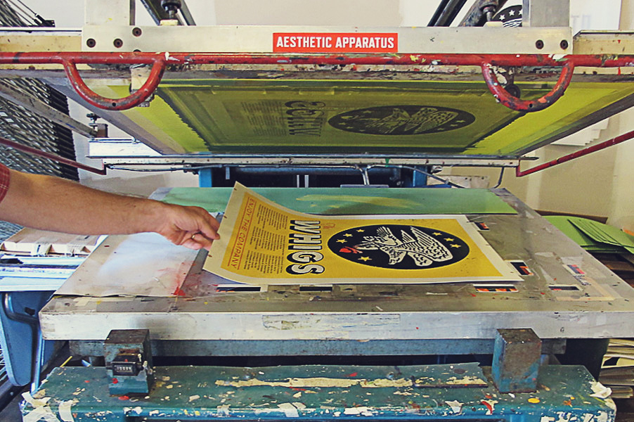
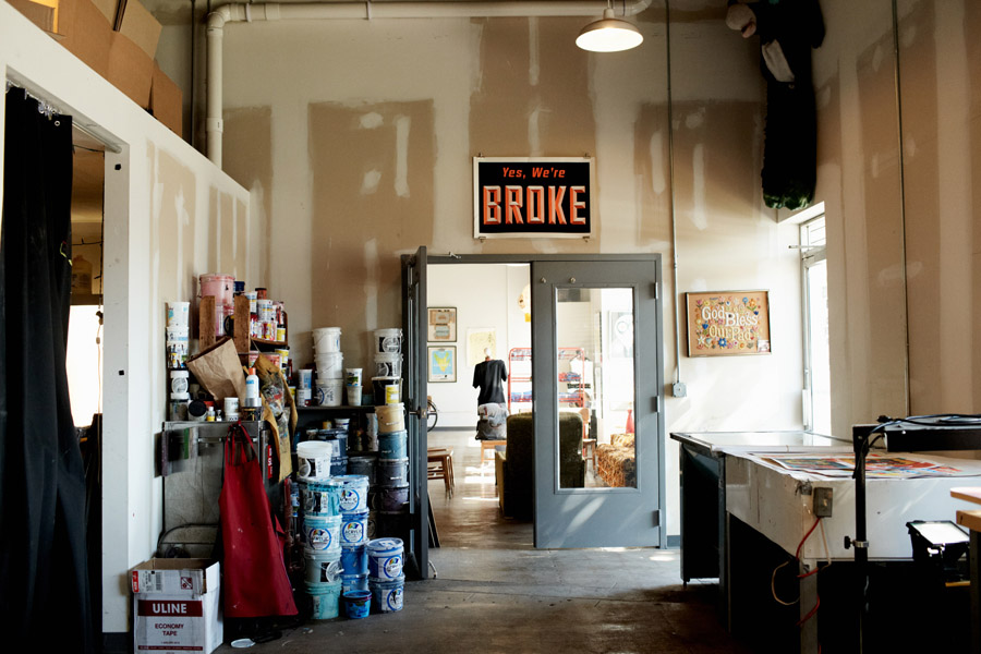
Most widely known for its hand-printed graphic gig posters, Aesthetic Apparatus has also made a name for itself by partnering with hip companies both near and far—from crafting labels for local brewery Surly Brewing Co., an indie staple in the Twin Cities area, to designing for the nationwide “Never Hide” Ray-Ban campaign, to starting its own informal design school (aptly named SCHOOLHAUS), it is an oversimplification to simply call AA a print studio. We caught up with Dan to hear his take on the intimacy of live music, the design process behind Aesthetic Apparatus’ ubiquitous gig posters, and more.
Aesthetic Apparatus’ posters seem to have a root in the gig posters of the past—posters that would actually alert the public of an upcoming show–yet the chances are that most people nowadays find out about gigs another way. For you, what then is the reason for keeping with this format that keeps date, time and location?
Of course most posters nowadays rarely serve the sole purpose of informing the public of an upcoming event. But when someone does collect a poster, it may be for the art alone but it may also be to commemorate the event itself. So, even though the poster may not need the detailed information prior to the date of the event, it is required after the event. People like to be able to say: “That date, that time, that location. I was there. I saw this.”
What, for you, is the appeal of creating a physical show poster as opposed to, for instance, a piece of digital art for a band?
In the specific case of a screen-printed poster, it is a print but it is also sculptural. Even though it is still just a piece of paper with ink on it, a person can feel the ink on top of the paper, the stippled quality of a halftone, or the chalkiness of a large flood of black. A screen-printed poster is an object, not just a print. I don’t think it’s too far off to argue that these days, the more digital things become, the more people appreciate an object with weight, texture, and presence.
What separates a poster for a band from other types of band merchandise? Do you think they have the same role?
You will get a different answer depending on who you ask. If we’re speaking, for example, of a T-shirt versus a poster, a shirt only has one voice it needs to speak for, the performer. It is the performer’s prerogative how and what that piece of merchandise feels and communicates. But with an event poster, there are much broader considerations to take into account in regards to producing an image: the venue, the city, the performer’s relationship to that city, the performer’s live stage presence, the time of year, the cultural role of the music, the music’s relationship to the audience, and vice-versa, just to name a few. The poster is an expression of the emotional connection between the performer, the performance, and the audience.
What has been the most exciting/difficult/interesting band poster you’ve created and for which band?
Years ago, when we were first getting started making posters in Madison, we did a poster forLow, with Shannon Wright opening. The night was perfect. It was cold and rainy, and the bands performed in an old music hall. The audience was silent and attentive, and just blown away. The band appreciated the posters so much they even plugged it on stage, suggesting people buy one on the way out – this was long before posters became ubiquitous objects of merchandise found at every show. It felt like such an honour, and the night was so inspiring and human. The energy from that night kept me going and making posters for years to come.